La chromolithographie
Hand-colouring or chromolithography: the pros and cons
"This essay attempts to explain why the plates of the second edition of Bourgery's Traité (Guerin, 1866-67) were not produced by the increasingly popular process of chromolithography. It establishes that most of its hand-coloured plates are identical to those of the first edition (Delaunay, 1831-54) and suggests that nearly all the original drawings must have been preserved on stone and used again for the second edition. Evidence of the reprinting of plates for a similar publication is taken into account when arriving at this conclusion. The comparative costs of hand-colouring and chromolithography are discussed in parallel with this investigation."
Two late twentieth-century books on medical illustration have drawn attention to the shift from hand-colouring to chromolithography for the plates of leading anatomical atlases of the nineteenth entury. 1 It was these accounts that led the editors of the present publication to ask why chromolithography was not used for the second edition of J. M. Bourgery’s Traité complet de l’anatomie de l’homme (Paris: L. Guérin et Cie., 1867 –71). Inevitably, without archival evidence, any answer to this question around hundred and fifty years later means some speculation and an attempt to put oneself in Guérin’s position, and perhaps that of the publisher of the first edition too.
As it happens, the question is entirely hypothetical, since there can be little doubt that all the plates of the first edition of Bourgery’s Traité (Delaunay, 1831–54), and those of the second edition (Guérin, 1866–67) were printed from the same set of stones, with one obvious exception. 2 All the other plates that have been compared show such similarities in the treatment of crayon hatching and lettering that they must have been printed from the same stones. This leaves two possibilities. The first is that sheets of the text and a stock of plates for the first edition were kept aside by the original publisher, who was perhaps waiting to see how sales went before committing himself to a second edition. The second is that the firm of Lemercier, the printer of most of the plates of the first edition (and all the later ones), was asked to keep the images on stone in readiness for a second issue or edition. Both possibilities will be explored below, but in neither case would a switch to chromolithography as a means of producing the plates have been contemplated.
The first edition of Bourgery’s treatise came out over a long period between 1831 and 1854, nearly all of its plates having been printed by the Paris lithographic firms of Bénard, Bénard & Frey, Lemercier, Bénard & Cie, and Lemercier. With very few exceptions the plates in its early volumes were printed by Bénard or Bénard and Frey. 3 The transition from Bénard to Lemercier in later volumes reflects the latter’s rise from a relatively insignificant figure in the lithographic trade to one of the leading lithographic houses in Europe. 4 Beginning as a humble workhand with the printer Pierre Langlumé, undertaking such tasks as grinding stones, he moved on to work for a short while as a foreman [contre-maître] for Mlle Clémence Formentin, one of the few women to run a lithographic press in her own right. After this he was employed by François Joseph Knecht, who ran the press originally established in Paris by Alois Senefelder, the inventor of lithography (and also Knecht’s uncle). 5 In 1828, when he was still in his mid-twenties, Lemercier set up his own lithographic business on a very small scale, at 2 rue Pierre Sarrazin, with just one press,. With the expansion of his activities he moved shortly afterwards to 55 rue du Four Saint-Germain, before finally settling into much larger premises at 57 rue de Seine.
Bénard’s imprint appears regularly in the earliest volumes of Bourgery’s treatise in various forms, but often as ‘Lith. de Benard’ or ‘Lith. de Benard et Frey’. Later volumes show Bénard working in partnership with Lemercier, as ‘Lemercier, Benard et Cie.’, at 4 rue de l’Abbaye (the former address of Langlumé, whose press Bénard had taken over in 1830). The sequence of names suggests that Lemercier was at least an equal partner, and from the late 1830s he emerged as the major printer of Bourgery’s plates, either in partnership with Bénard or on his own. From around 1840 until the publication ended the imprint ‘Lemercier & Cie, Paris’, or something similar, appears regularly on the plates. Nicolas Henri Jacob, undertook or supervised the drawing of all the plates, but most were put on stone by specialist lithographers. By the middle of the century Lemercier & Cie had a whole team of lithographic artists working for him, though it is not clear whether those who contributed to Bourgery’s Traité were freelance artists or could be considered his employees. 6 By this time hiss firm had become the leading chromolithographic house in France, fig. 1 and the year after completion of the first edition of Bourgery’s Traité he was awarded the ‘médaille d’honneur’ at the Exposition Universelle in Paris of 1855 for its pre-eminence in lithography. 7 The Lemercier firm continued to flourish, and on Rose-Joseph’s death in 1887 it passed to his nephew Alfred.
Whatever the arrangements may have been for the drawing of the 726 plates for Bourgery’s treatise and for putting them on stone, it represented an enormous investment in time and money. Though is is often said that lithographic drawing was cheaper than engraving on copper, it would still have been a very slow and painstaking business to draw the plates required for such a major and complicated undertaking. Not only did the complicated anatomical drawings involve building up a subtle range of tones by means of crayon hatching, but their parts had also to be labelled and keyed into the images.
Given the complexity of this work, it may have been decided from the outset that it was sensible to print more copies than were needed of the plates in the hope that sales would justify a further issue of the book when the initial publication went out of print. Though this would have meant extra costs at the outset, the expense of hand-colouring the plates and binding the volumes (largely a hand operation at this stage) could have been put on hold until sales justified colouring further copies. In such a situation it would have been possible for Guérin to take over the stock of unused plates (and possibly sheets of the text) from the publisher Delaunay. Such practices are not unprecedented and, unless contrary evidence is forthcoming, cannot be ruled out. However, such an arrangement would probably mean that the number of copies available for any reissue or second edition was somewhat limited.
The alternative possibility, that the drawings were preserved on stone for future use – rather than following the normal practice of grinding them away so that the stones could be used again – would also have been costly. But the investment in such carefully produced and detailed lithographic crayon drawings may well have persuaded Delaunay to carry the cost of preserving them on stone in anticipation of a second printing. Any decision to do this would have been made from the very outset, since the work was to be published in parts; inevitably, the cost of storing the stones would have increased over the years as more and more parts were issued. The overall expense of such a decision would not have been limited to the cost of storage in Lemercier’s large stone stores: it would also have needed to include compensation for his loss of the use of the stones, the purchase of which would have represented a considerable capital outlay. 8 An arrangement of this kind is likely to have led to work on an occasional stone being damaged in some way over the intervening decades.
This second explanation may seem less plausible than the first for several reasons, but mainly because the longer an image remained on stone the more difficult it would have been to revive it for reprinting. As it turned out, the time that elapsed between the two editions meant that many images would have remained on stone for over thirty years. However, there is clear evidence that the original drawings were retained on stone and reprinted, since the images of most of the plates of the two editions are identical. fig. 2 et 3 What is more, scores of plates of the first two volumes of the second edition are lettered ‘Imp. Becquet, Paris’, thus replacing those of the first edition that carry the imprint of Bénard or Bénard and Frey. fig. 4 et 5 Other plates of the second edition have no imprints, which suggests that the names of the original printers were erased from the stones before reprinting, either by Becquet or another printer. These two changes seem to establish beyond reasonable doubt that many plates of the second edition were reprinted from the stones drawn for Delaunay. 9 One plate in the Guérin edition, which appears in reverse of the same plate in the Delaunay edition, was completely redrawn, presumably because the stone had been lost, broken or otherwise damaged. 10 - fig. 6 et 7
Support for the belief that most of the stones of the Delaunay edition were reprinted for Guérin comes from a similar illustrated publication whose images on stone were reprinted after an even longer period of storage: Ludovic Hirschfeld’s major work on the nervous system, Névrologie ou description et iconographie du système nerveux. Hirschfeld’s book was published in parts by Baillière in Paris between 1850 and 1852 (with a publication date of 1853); its lithographed plates were then reprinted for two further publications many years later. This reveals that such reprinting was technically possible. What is more, Hirschfeld’s plates came from the same production stable as those of Bourgery’s Traité. All its ninety-two plates (a nominal number since some are combined) were drawn by J. B. Léveillé after specimens prepared by the author, and were printed by Lemercier and published by Baillière in both hand-coloured and uncoloured versions. A second edtion of Hirschfeld’s book appeared with the title Névrologie et esthésiologie. Traité et iconographie du système nerveux et des organes des sens de l’homme (Paris: Victor Masson et Cie, 1866), with a substantially revised text but with unchanged plates, the author claiming that: ‘… tous les changements ont porté exclusivement sur le texte, et j’ai dû laisser les planches intactes. En effet, une préparation étant bien faite et bien reproduite, et la nature restant partout et toujours la même, aucune modification de ce côté ne pouvait être ni utile ni désirable.’ 11
Two further versions of the Hirschfeld’s book were published in London with English language texts and with essentially the same plates – though only selections of them – as those of the two French editions. One was published by John Churchill and Sons as The anatomy of the nervous system, with the wrappers of its first parts dated 1866; the other, An atlas of the central nervous system and cranial nerves, edited by H. H. Tooth, was published with just thirty-seven plates by J. & A. Churchill in 1890. The plates of these later editions show signs of wear, and in some cases retouching, but there can be little doubt that they were printed from the same stones as those of the French editions. Curiously, some plates of both English versions were blind embossed within an oval design ‘Colorié par Mme Lemaitre’ fig. 8 , whereas the plates of the hand-coloured copy of the 1853 edition of Hirschfeld’s book in the British Library were not. The paper used for the plates of the 1853 and 1866 editions are broadly comparable, whereas that of the 1890 edition appears to be either coated or loaded with china clay. But whatever the technicalities, its paper is very different from that of earlier editions, which establishes beyond doubt that excess copies of the plates of earlier editions were not used. In turn this leads to the conclusion that the images put on stone in Paris in the early 1850s must have remained on them for almost forty years.
The publication history of the lithographed plates originally made for Hirschfeld in the early 1850s provides conclusive proof that images on stone could be printed from successfully after a long period. It reinforces the case for the plates of Bourgery’s Traité being reprinted, but does not exclude the possibility that some superfluous impressions of plates printed for the Delaunay edition were included in the Guérin edition. For example, plate 3 in volume three of the Strasbourg copy of the Guérin edition still has the imprint ‘Imp Lemercier, Bernard et Cie’ and plate 42 of the same volume ‘Imp. Lemercier à Paris’. This might suggest that both were printed at the same time as the equivalent plates of the Delaunay edition (though they could have been reprinted before arrangements had been made for the remainder of the plates to be printed elsewhere, or reprinted by another lithographer who failed to remove the original imprint).
It could be that Guérin’s edition of Bourgery’s Traité made use of impressions from both the sources mentioned above. The likelihood is that most of its plates were reprinted from the stones drawn for the Delaunay edition (with their imprints removed or changed), but some of its plates may be impressions, extra to requirements, that were taken at the time for Delaunay. Given these two possible sources for his plates, it is inconceivable that Guérin would have commissioned new plates by means of chromolithography.
It may be asked why colour could not have been added to the existing black workings of the plates instead of adding colour to them by hand. This could certainly have been done, but it would have meant making adjustments as the drawings on stone were made to work visually in monochrome and also when coloured by hand. It was rare for chromolithographs to imitate hand-colouring, partly because some printing inks were opaque and would therefore have reduced the richness of the underlying black printing. In any case, chromolithography demanded a different kind of drawing, not least because it involved the allocation of colours to separate stones in order to allow for the overprinting of colours. That aside, one of the great commercial advantages of hand-colouring was that it could be done on demand, whereas the considerable costs of allocating colours to different stones and printing an entire edition in colour had to be carried up front.
Taking all these things into account, and despite the many advances that had been made technically in chromolithography since the publication of the first edition of Bourgery’s treatise, we have to rule out the possibility of any publisher investing in new sets of work on stone for colour printing. In any case, why change the means of production of plates for what seems to have been a successful publication?
Taking all these things into account, and despite the many advances that had been made technically in chromolithography since the publication of the first edition of Bourgery’s treatise, we have to rule out the possibility of any publisher investing in new sets of work on stone for colour printing. In any case, why change the means of production of plates for what seems to have been a successful publication?
For the sake of the argument, we may have to ignore such issues in order to weigh up the advantages and disadvantages of the hand-colouring of lithographs and chromolithography for the plates of books, particularly scientific publications, that appeared around the middle of the nineteenth century. Chromolithography was not the only colour printing process available at the time, and even in the eighteenth century Le Blon’s approach to printing in colours using the intaglio process of mezzotint had been successfully applied to the production of anatomical plates by his pupil and successor Gautier d’Agoty. 12 In the nineteenth century, when colour printing took several different forms and was applied to a wide variety of products, three periods can be identified as ones in which significant progress was made towards the effective production of images in colour. They occurred in the years either side of 1820, in the second half of the 1830s, and in the mid 1860s.
The first of these periods includes the publication of the various editions of Senefelder’s treatise on lithography of 1818 and 1819 (two of which reproduce a piece of early printing by Fust & Schöffer in three colours 13), the security printing process called compound-plate printing (in France ‘à la Congreve’ after the name of its British inventor), 14 J. A. Barth’s Pacis annis MDCCCXIV et MDCCCXV foederatis armis restitutae monumentum (Breslau [Wroclaw], 1818) with borders to its plates printed in colour by lithography, 15 and the relief-printed colour specimens that William Savage printed for his book Practical hints on decorative printing (London, 1822). 16 The second period covers an even wider range of techniques and countries: George Baxter’s process of printing in colour from a combination of intaglio and relief plates, which he patented in England 1835/1836, 17 Frédéric Emile Simon’s colour plates for Midolle’s published collections of lettering and alphabets (Strasbourg, 1834–37), 18 Godefroy Engelmann’s French patent of 1837 for his (mainly) four-colour process of ‘chromolithographie’, 19 Charles Knight’s ‘Illuminated printing’ from relief blocks, which he patented in England in 1838 and used for the plates of his own popular publications, 20 and Gustave Silbermann’s experiments with relief printing in colour in Strasbourg in 1840. 21 The third period, the mid 1860s, was mainly associated with advances in printing from powered machines, particularly the development in France of lithographic presses that were capable of relatively fast printing in colour. The importance of the latter was discussed following the high profile given to colour printing at the Exposition Universelle in Paris in 1867. 22
Clearly, when the first volume of the original edition of Bourgery’s Traité, was published in 1831, colour printing would not have been sufficiently advanced for Delaunay even to have considered using it for the publication’s plates. Later volumes simply followed the broad pattern of the first, as there had been no substantial developments in printing technology to warrant a change in plan. Regardless of the particular process employed, printing the plates of anatomical publications in colour would have been a risky and extremely costly proposition, even in the middle of the century. Apart from anything else, at the time most colour printing from relief blocks (or copies of them in metal), or from relief blocks added to a foundation intaglio printing, was limited to relatively small-format publications. Lithography lent itself to much larger images than these other processes, even before the middle of the century, so was ideally suited to plates of anatomical and similar publications, though it still relied on hand-colouring.
For the most part, printing in colour by means of lithography (chromolithography) tended to fall into one of two very different categories for several decades: either flat-colour work in ink, or attempts to simulate a range of tones and hues by drawing in crayon, sometimes by stippling in ink. The first approach was widely used for plates in publications on the decorative arts and also for commercial ephemera, such as labels; the second was applied to the reproduction of works of art, copies of popular paintings, and facsimiles of medieval illuminated books and original work that imitated them. By around 1870 both approaches had led to a remarkable array of publications.
Works in the first category began with a series of volumes on the decorative arts published by Georg Reimer in Berlin in the 1830s, and continued with such landmark publications as Owen Jones’s Plans, elevations, sections, and details of the Alhambra (London, 1836–45) and The grammar of ornament (London, 1856), and Auguste Racinet’s L’Ornement polychrome (Paris, 1869). Publications in the second category include the gift books of Henry Noel Humphreys that were published in England in the 1840s (though some were printed in France), the series of reproductions of works of art issued by the Arundel Society in London from 1856 (which included fine examples of printing by Storch and Kramer in Berlin and Hangard-Maugé in Paris), and a series of opulant books in the medieval manner produced by Lemercier for the publisher Curmer, such as L’imitation de Jesus-Christ (Paris, 1855–57), Le livre d’heures de la Reine Anne de Bretagne (Paris, 1859–61) and – in the very years when the second edition of Bourgery’s Traité was published – the Œuvre de Jehan Fouquet (Paris, 1866, 1867). 23
Nevertheless, whether by chromolithography or by some other process, colour printing was not at all common in natural science publications until relatively late in the nineteenth century. A clear exception to this are the exquisite wood-engraved illustrations of the artist Lydon in combination with the wood-engraver and printer Benjamin Fawcett in the 1860s, among them the four volume A history of the fishes of the British islands by Jonathan Couch (London: Groombridge, 1862–65).
The reasons for the relatively slow take-up of colour printing for books on the natural sciences are partly economic and, one suspects, partly to do with the expectations of authors, publishers, and readers. Unfortunately neither of these assertions can be backed up with a great deal of concrete evidence. The economic reason for retaining hand-colouring in the face of clear technical advances in colour printing in the nineteenth century were threefold. The first concerned the size of the print run or edition. In general, the fewer copies of an illustration needed in colour the more likely it is that the decision favoured hand-colouring. As edition sizes increased to meet a growth in education, reading, and study, and as cheaper paper and production methods became available, so gradually the balance shifted towards colour printing.
The second reason had to do with the nature of the colouring. Small patches of colour in a wide variety of hue – of the kind often needed in natural history illustrations – were likely to be expensive in colour printing but relatively easy to add by hand. However, solid areas of colour with parts within them that needed to remain uncoloured – which is common in decorative illustration – presented considerable problems for the hand-colourist but were relatively simple to achieve in colour printing. A third issue, referred to above, strongly favoured hand-colouring. Printing in colour, particularly in many colours, made sense economically only if an entire edition could be produced as a single exercise, though possibly over several or many days. By contrast, hand-colouring could be done more or less on demand, thus reducing the initial financial outlay and defraying some costs until sales justified further work. Hand-colouring also gave publishers the option of issuing uncoloured copies at a lower price, as was the case with Bourgery’s Traité.
In lithography the comparative cost of hand-colouring and colour printing seems to have been raised for the first time in the late 1820s, when the Société d’Encouragement in Paris offered a prize of 2000 francs ‘pour l’impression lithographique en couleur’. The award was announced in 1829, in volume 28 of the Bulletin de la Société d’Encouragement, two of the stipulations being that participants should provide 1000 copies of their submissions and that they should be able to demonstrate that they could produce them at a lower cost than by hand-colouring. 24 Participants had to support their submission with an exact description of their methods and also a statement of costs. Submissions were to be made before 1 July 1830, so that an award could be made at the Society’s general meeting later in the year. As it happened, no prize was awarded at the time, though each of the three competitors attracted an honorable mention. The Society continued to offer its prize for lithographic colour printing through to 1837, though with a mixed response. In 1831 there were initially three participants, one of whom withdrew, and in 1833 there were just two. 25 Eventually, in 1838, Godefoy Engelmann was awarded the full prize of 2000 francs 26, having already been granted a patent for his process of ‘chromolithographie’ and a gold medal for it by the Société industrielle de Mulhouse in the previous year. 27 In his submission to the Société d’Encouragment in Paris Engelmann presented figures which suggest that his chromolithographs cost not much more than half that of hand-coloured lithographs (1fr. 25c compared with 2 fr. 40c). 28 Nonetheless, the sluggish response to the Society’s well promoted competition underlines the point made above: that Delaunay had no effective alternative to hand-colouring when launching the first volumes of Bourgery’s Traité in 1831.
From much the same period we have comparative costings of hand-colouring and chromolithography for a particular publication. The circumstances were most unusual and arise from a mistake in the printing of one of the four double-spread plates of G. A. Hoskins, Travels in Ethiopia (London: 1835), all of which were printed in four colours and had additional hand-colouring. Charles Hullmandel was the printer of the plates and Longman the publisher. It is the latter’s records that reveal the cost of rectifing the mistake. The precise circumstances are not known, but Hullmandel reprinted all four colour plates, abandoning the additional hand-colouring of the first issue and printing the extra copies needed entirely in colour (the number of colours on each plate varying from six to eight). 29 Longman’s ledgers reveal that printing 525 copies of its four chromolithographed plates, each of which had three more printed colours than those of the first issue, worked out at one and a quarter old British pennies [1¼ d.] compared with just under one old penny [1d.] for adding three colours by hand to a similar number of plates. In this case, though the costs related to the same four plates, the areas of colour that were needed differed in size. There are therefore too many variables to generalize from this example, particularly as the colour printing included an overall grey tint with blank areas within it, an effect that would have been very difficult to achieve when colouring by hand. What it does indicate, however, is that even in a relatively small edition, and as early as the mid 1830s, colour printing was on the point of becoming competitive with hand-colouring for this kind of flat-colour work.
The nature of what had to be produced was clearly a key factory when deciding whether to stay with the prevailing method of hand-colouring. A letter from the British artist Francis Bedford to the York publisher Robert Sunter of 24 July 1851, concerning some illustrations he was preparing for an architectural publication, indicates that the route to take was still undecided for some kinds of work in the middle of the century. 30 In one passage Bedford wrote:
‘I send you with this proofs of the first Stone of the Crucifixion and Choir Windows. These we shall work out in Colors on Stone as there is no difficulty in doing so, and it will save a good deal of expense, which in these days is an important consideration.’
But when referring to a coloured study by Fisher for the same publication, he made some different points concerning hand-colouring and printed colour:
‘I propose that this plate should be colored by hand, as it will require to be
lightly and nicely colored, and with very bright colors. I will if you like
get one or two done as a pattern. It would perhaps be as well if I were to do
a shade stone to give expression and finish to all those parts that require, as
it will save a good deal of work to the colorer.’
Hand-colouring, particularly when it had to be precise in scientific work, was by no means cheap. This is revealed by an invoice sent to the Linnean Society of London by British lithographic printer Vincent Brooks, dated 1 November 1856. 31 It relates to a set of plates for a paper written by Joseph Dalton Hooker, ‘On the structure and affinities of Balanophoreae’, which was to be published in the Transactions of the Linnean Society of London (vol. 22, 1859). The paper included sixteen plates, all of which were drawn by Hooker, put on stone by the prolific botanical illustrator Walter Hood Fitch, and printed in London by Vincent Brooks. Four of the plates were printed in brown ink and subsequently coloured by hand; the remaining twelve were printed in black ink and not coloured. The costs of the lithographic work, that is the preparation and proving of the stones (and of the lettering and its proving) amounted to £8 for all sixteen plates. The cost of the paper and printing of 750 copies of a sheet consisting of four plates in black ink was £16 10s. 0d. [£16.50], and for the paper and printing of the same number of copies of twelve plates on three sheets in brown ink £54. The black sheets were therefore marginally cheaper than the brown ones. These figures can be compared with the cost of hand-colouring four of these plates, each presumably in 750 copies, at an estimated unit cost of 3.75 old pence, which amounted to £48. The cost of hand-colouring just these four plates represents, therefore, well over half the combined cost of the paper and the lithographic printing for all the sixteen plates of Hooker’s paper.
It seems that the expectations of those who commissioned work, as well as those of the assumed readership, played a part in the survival of hand-colouring in some fields long after it had been abandoned in others. Whereas books on the decorative arts were beginning to appear with chromolithographed plates in the 1830s and were reasonably common by the middle of the century, the publishers of natural history books seems to have been reluctant to change their habits. This applied even in the case of popular publications in large editions, such as a series issued by Reeve, Benham, and Reeve in London in the 1850s, when printing in colour would almost certainly have been cheaper. 32 Thirty or forty years later publishers were beginning to accept color printing for such work, as Frederick Sander revealed in the introduction to his Reichenbachia. Orchids illustrated and described (London, 1888–94). Some of the 192 plates of this four-volume publication were entirely chromolithographed, whereas others had some colour added by hand. The introduction to the book sets out the criteria for choosing between the two in the following way: ‘some of the plant-portraits will be coloured by lithography, others will be hand-painted when found expedient.’ – in other words, when it was cheaper to do so.
One solution to resolving the apparently conflicting requirments of economy and graphic subtlety was to follow the route taken by Sander and to combine colour printing with hand-colouring. This was almost the favoured position from the very beginning of chromolithography, and for many different kinds of work. The practice was so common that, when promoting their colour printing methods, both Godefroy Engelmann in Mulhouse and Charles Hullmandel in London made a point of emphasizing that their processes did not involve any hand-colouring at all. 33 In general, large flat areas of colour were likely to be cheaper when printed in colour than when washed in by hand. For this reason skies, foregrounds of landscapes, large leaves of plants, and similar areas, were often printed in colour, whereas touches of colour needed for such features as the clothes of figures in a landscape, small decorative features of a building, and the subtle colouration of blooms were frequently added by hand. Hand-colouring was sometimes added to printed colour, either to re-inforce its hue or to make some colouristic variation, and greater richness could be achieved by adding varnish to particular parts of a print.
For the most part, natural science books with plates, particularly those on ornithology and botany, shunned colour printing until the final decades of the nineteenth century. It may therefore be worth placing anatomical books, and Bourgery’s in particular, within a wider context. The plates for the great bird books that were drawn by William Swainson, Edward Lear, John Gould, and John Gerrard Keuleman in the first three-quarters of the nineteenth century all take the form of hand-coloured lithographs. 34 Exceptionally, Josef Wolf’s two small books, Poets of the woods (1853) and Feathered favourites (1854), did have chromolithographed plates but, as their titles suggest, they made no scientific claims. The turning point for ornithology came in the last decades of the century with two books that were illustrated with chromolithographs, either wholly or mainly, by Archibald Thorburn: W. Swaysland’s Familiar wild birds (1883–88) and T. L. P. Lilford’s seven-volume Coloured figures of the birds of the British Islands (1885–98). Though British printers were employed for the latter, the majority of the plates were printed in Berlin by Wilhelm Greve. Around the same time Dr Richard Bowdler Sharpe, editor of the British Museum of Natural History’s Catalogue of the birds in the collection (1874–98), which was publshed in 27 volumes, switched from hand-coloured plates to chromolithography (from volume 14 onwards). A similar shift from hand-colouring to chromolithography is also seen in some publications that ran to later editions. For example, A. G. Butler’s Foreign finches in captivity (London: L. Reeve & Co., 1894) was originally published in parts with crayon-drawn lithographs by W. H. Frohawk, either uncoloured or coloured by hand, but a second edition (London & Hull: Brumby & Clarke, 1899) had its plates printed in stippled lithography by the book’s publisher. 35
As was the case with anatomical illustration, some publications did have their illustrations printed in colour, but from a single plate inked ‘à la poupée’, that is, selectively in different colours. Robert John Thornton’s Temple of Flora (1799–1807) stands as the major work of its kind though, like many other florilegia, its plates have some hand-colouring. Thereafter the hand-colouring of a monochrome foundation image, whether in some form of intaglio printing or lithographed, remained the accepted approach to botanical illustration for decades. Some of George Baxter’s colour prints of flowers, though not illustrations, are unusual in this respect, a fine example being his ‘Hollyhocks’ of 1857, which was printed from a foundation steel-engraved plate and eleven relief blocks, each inked in a different colour. 37 Early chromolithographed exceptions include Charles Lemaire’s Le Jardin fleuriste (Ghent, 1851–54), which described itself as a general botanical and horticultural journal. While the English Botanical magazine remained firmly wedded to hand-colouring in this period, Lemaire’s journal included plates printed in four to six colours on a black working, almost in imitation of hand-colouring. Exceptionally too, the Belgian printer Severeyns printed thirty-two impressive chromolithographed plates after Berthe Hoola van Nooten’s drawings for her Fleurs, fruits et feuillages choisis de la flore et de la pomone de l’Isle de Java (Brussels, 1863). He followed this up with chromolithographed plates for two substantial horticultural publications: The Herefordshire pomona (London and Hereford, 1876–85) and the Nederlandsche flora en pomona (Groningen, 1876–79). For the most part, however, chromolithography was not to replace hand-colouring in botanical and horticultural publications until the closing decades of the century.
A key general work on botany that made substantial use of chromolithography in this period was Anton Kerner von Marilhaun’s Pflanzenleben, 2 vol. (Leipzig: Bibliographisches Institut, 1887, [& Vienna] 1891), which was soon to be translated into English as The natural history of plants (London: Blackie & Son, 1894, 1895). 38 Though illustrated throughout its text with a couple of thousand wood-engravings, it includes quality chromolithographed plates that were printed by its publisher, the Bibliographisches Institut (forty in the original edition, just sixteen in the English translation). By the early twentieth century, in botany as in ornithology, hand-colouring had become an anachronism. But the future for the following few decades lay not so much in chromolithography as in the new photo-mechanical processes, at the heart of which lay the idea of printing in just three or four colours.
The reasons for the survival of hand-colouring in some fields long after colour printing (particularly chromolithography) had replaced it in others are varied and complex, but popular prints, works on the decorative arts, reproductions of paintings, topographical and geological maps, book illustration in general, and ephemeral advertising were all being printed in colour decades before this became common in the natural sciences. Needless to say, print runs of scientific publications are not likely to have been long when compared with those of some other kinds of work, and this would have favoured hand-colouring. But there remains the issue of expectations and the apparent belief that colour printing could not match the subtle variations of hand-colouring required in the natural sciences. The comparison of a single copy of a hand-coloured illustration with a colour-printed equivalent, or near equivalent, might well lead to such a view. But how similar are hand-coloured plates when different copies from the same edition are compared with oneanother? This is a question rarely asked. But the consistency that colour printing could offer when compared with hand-colouring does not generally seem to have been a factor when choosing between the two methods. A documented exception is the Herefordshire pomona, which is briefly referred to above. In this case, though the cost of colour printing was held to be very high and nearly brought the publication to a halt, it was regarded as essential for the correct representation of countless varieties of apples and pears, some of which could only be identified by their superficial characteristics. 39 In the longer term this was to become one of the contributions that colour printing was to offer publishers of illustrated scientific works.
Hand-colouring or chromolithography: the pros and cons
Michael Twyman is Emeritus Professor of Typography & Graphic Communication at the University of Reading, where he has taught for over half a century. He is currently Director of the Centre for Ephemera Studies at Reading and also teaches MA students on a part-time basis. He has written numerous articles on printing history and graphic design, and over a dozen books, including Printing 1770–1970 (1970), Lithography 1800–1850 (1970), Early lithographed books (1990), Early lithographed music (1996), Breaking the mould: the first hundred years of lithography (2001), and A history of chromolithography (2013). He is President of the Ephemera Society and Vice President of the Printing Historical Society.
1/ Paule Dumaitre, Histoire de la médecine et du livre médical (Paris, 1978), pp 334, and K. B. Roberts & J. D. W Tomlinson, The fabric of the body: European traditions of anatomical illustration (Oxford, 1992), p. 538. Such observations may have led to the plates of the second edition of Bourgery’s Traité to be described as chromolithographs in several recent publications.
2/ See below note 10.
3/ For Jean-François Bénard (brevété 1828) and Jean-Georges Frey (active
1832–1850), both of whom also worked independently, see the online
‘Dictionnaire des imprimeurs-lithographes du XIXe siècle’ of the École
nationale des Chartes.
4/ For the Lemercier firm see especially Corinne Bouquin, ‘Recherches sur
l’imprimerie lithographique à Paris au XIXème siècle: l’imprimerie
Lemercier (1803–1901)’, Thèse de l’Université de Paris I – Sorbonne
(1993), and, for its chromolithographic work, Michael Twyman, A history
of chromolithography: printed colour for all (London: British Library;
New Castle DE, Oak Knoll, 2013).
5/ Bouquin, Recherches sur l’imprimerie lithographique à Paris, vol. 1, p. 122.
6/ Twyman, Chromolithography, pp. 232, 358, p. 358 n. 53.
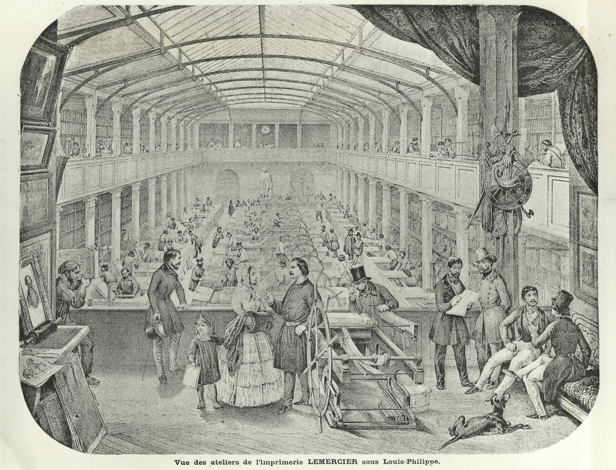
fig. 1/ Lemercier’s pressroom in the rue de Seine, Paris, ca. 1846, at a time when plates for Bourgery’s Traité may have been in production. Most of the presses are made of wood, the one being demonstrated in the foreground is an iron press patented by Eugène Brisset in 1844. Stones are stored on the walls like books in a library. From an advertisement of Lemercier’s firm in Le Figaro lithographe, 1895.
7/ Exposition universelle de 1855, Rapports du Jury mixte international, 2 vol. (Paris, Imprimerie impériale, 1856), vol. 2, p. 1230.
8/ See Michael Twyman, “Lithographic stone and the printing trade in the nineteenth century”, Journal of the Printing Historical Society, no. 8, 1972, pp. 1-41.
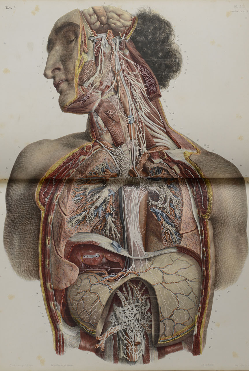
fig. 2/ Édition Delaunay, Tome III, planche 42 © Université de Strasbourg, Service Commun de la Documentation (dépôt BNU)
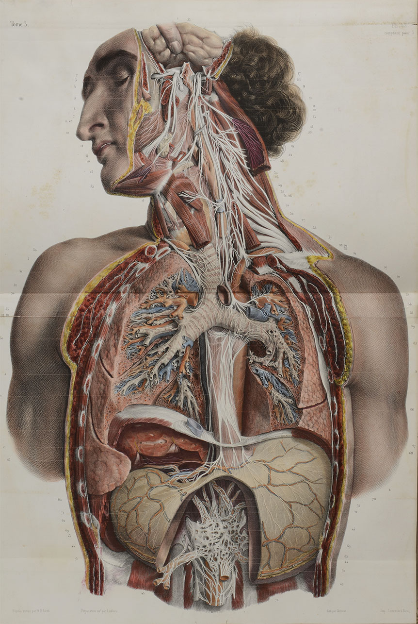
fig. 3/ The mention « Imp Lemercier à Paris » is the same as in the édition Delaunay. Édition Guérin, Tome III, planche 42 © Université de Strasbourg, Service Commun de la Documentation (dépôt BNU)
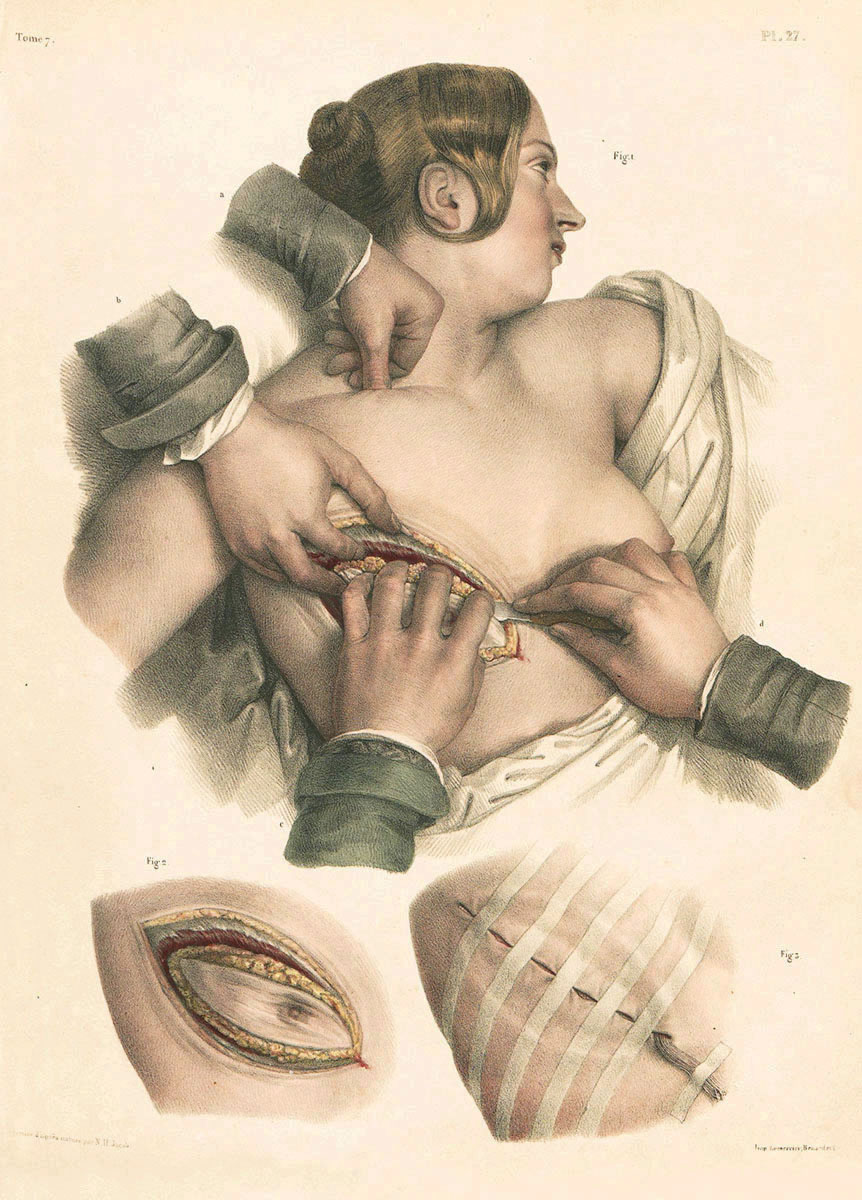
fig. 4/ Édition Delaunay, Tome VII, planche 27 © Université de Strasbourg, Service Commun de la Documentation (dépôt BNU)
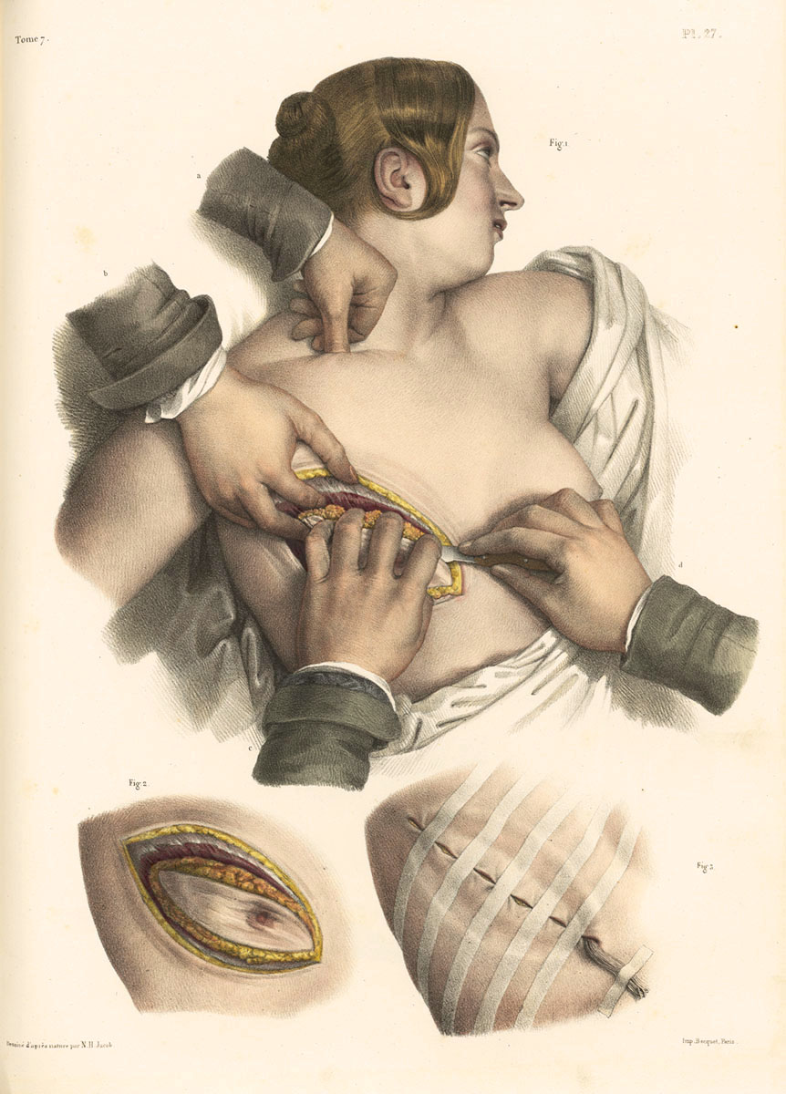
fig. 5/ The mention « Imp. Becquet, Paris. » replacing « Imp. Lemercier, Benard et C ». Édition Guérin, Tome VII, planche 27 © Bibliothèque interuniversitaire de santé, Paris
9/ There were three lithographic printers with the name Becquet working in
Paris in the 1830s and 1840s: Charles Germain, Louis Lubin, and Pierre
Prudence Louis (‘Dictionnaire des imprimeurs-lithographes’. At some
stage all worked from 2 rue Pierre Sarrazin (the location of Lemercier’s
first press).
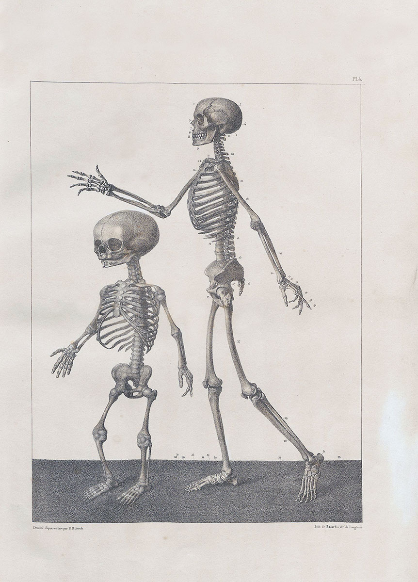
fig. 6/ Édition Delaunay, Tome I, planche 4 © Université de Strasbourg, Service Commun de la Documentation (dépôt BNU)
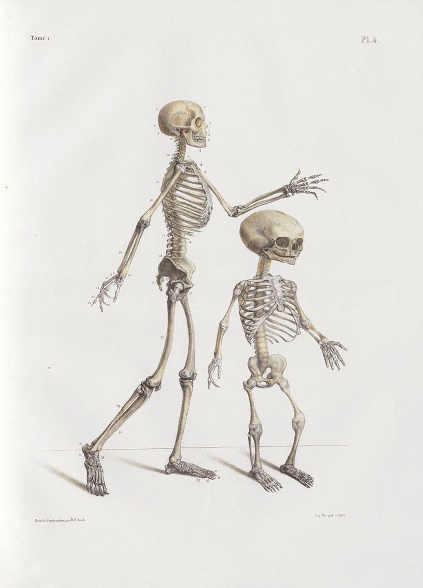
fig. 7/ The name of the original printers « Imp. Lemercier, Benard et C » was erased from the stones and replaced by the mention: « Imp. Becquet à Paris ». Édition Guérin, Tome I, planche 4 © Bibliothèque interuniversitaire de santé, Paris
10/ Vol. 1, plate 4 in both editions. In this case the lithographic artist seems
to have taken the easy way out by copying fairly freely an impression
onto a fresh stone without reversing it, thus producing a plate that is in the
opposite orientation of the original.
11/ Préface de la seconde édition, p. x.
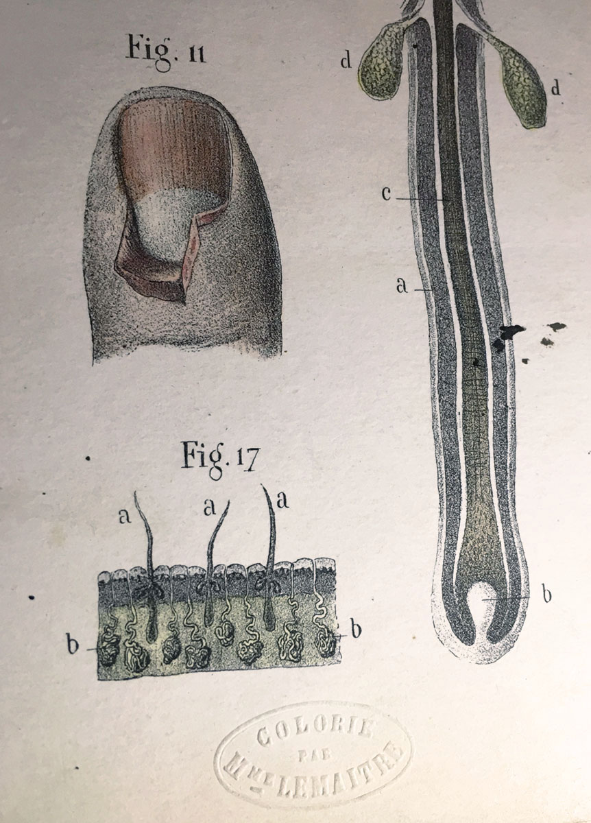
fig. 8/ Blind embossed « Colorié par Mme Lemaitre »
J. B. Léveillé, Névrologie et esthésiologie. Traité et iconographie du système nerveux et des organes des sens de l’homme, Paris : Victor Masson et Cie., 1866.
© Bibliothèque interuniversitaire de santé, Paris
12/ See Colin and Charlotte Franklin, A catalogue of early colour printing from chiaroscuro to aquatint (Culham: the authors, 1977).
13/ Alois Senefelder, Vollständiges Lehrbuch der Steindruckerey (Munich et Vienna, 1818), and A complete course of lithography (London, 1819).
14/ Twyman, Chromolithography, p. 23.
15/ Twyman, Chromolithography, pp. 77–79.
16/ Michael Twyman, Printing 1770–1970 (London: Eyre & Spottiswoode, 1970; reprinted The British Library, 1998), pp. 38–39, 43.
17/ C. T. C. Lewis, George Baxter the picture printer (London: Sampson Low, Marston & Co., 1924).
18/ Twyman, Chromolithography, pp. 88-90.
19/ Twyman, Chromolithography, pp. 101-108.
20/ Twyman, Printing 1770–1970, pp. 39, 43.
21/ Twyman, Chromolithography, pp. 73–74, 319–21.
22/ Exposition universelle de 1867, Rapports du Jury international, publiés sous la direction de M. Michel Chevalier (Paris : Imprimerie administrative de Paul Dupont, 1868), vol. 2, p. 72.
23/ All the books mentioned in this paragraph are discussed in Michael Twyman, Chromolithography.
24/ Programmes des prix proposés par la Société d’Encouragement pour l’industrie nationale, dans sa Séance générale du 16 Décembre 1829, pour être décernés en 1830, 1831 et 1832, annexe, pp. 9–10. See also Twyman, Chromolithography, pp. 68, 86–87.
25/ Twyman, Chromolithography, p. 86.
26/ Twyman, Chromolithography, p. 87.
27/ Bulletin de la Société industrielle de Mulhausen, vol. 10, 1837, no. 49, pp. 313–22, Twyman, Chromolithography, p. 107.
28/ Bulletin de la Société d’Encouragement, vol. 36, 1837, pp. 465 n. 1, 504-
506, Twyman, Chromolithography, pp. 68 n.18, 108, 110.
29/ See Bamber Gascoigne, “The earliest English chromolithographs”, Journal of the Printing Historical Society, no. 17, 1982/83, pp. 62-71, and Twyman, Chromolithography, pp. 112-113.
30/ Sunter Correspondence, West Yorkshire Archive Service WYL149, Francis Bedford à Robert Sunter (libraire et éditeur, 23 Stonegate, York, 1843-56). Quoted Twyman, Chromolithography, p. 69.
31/ Library of the Linnean Society, London.
32/ For example, the plate in Mary Roberts, Voices from the woodlands (London, 1850), one of which is reproduced in Twyman, Chromolithography, fig. 47.
33/ Twyman, Chromolithography, pp. 102, 116, 126.
34/ See Christine E. Jackson, Bird illustrators: some artists in early lithography (London: H. F. & G. Witherby, 1975).
35 Twyman, Chromolithography, p. 238.
36/ See Wilfred Blunt, The art of botanical illustration (London: Collins, 1950).
37/ Lewis, George Baxter, no. 276.
38/ A plate from the English edition is reproducted anglaise in Twyman, Chromolithography, fig. 186.
39/ See Michael Twyman, ‘The plates of the Herefordshire pomona’, in The
Herefordshire pomona, facsimile edition, (London: Folio Society, 2014),
vol. 2, pp. xi–xvi. Those concerned with the publication of the original
edition were so concerned with fidelity that they referred to the
individual images of the fruit as ‘chromo-lithographic portraits’ (pp.
xiii, xv).